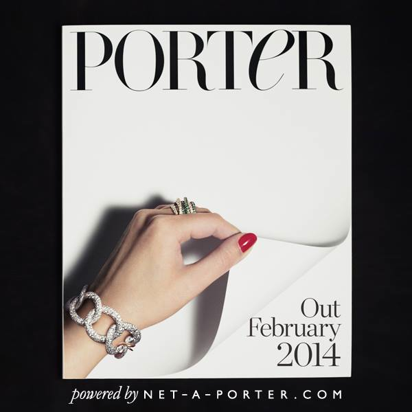
Luxury online department store NET-A-PORTER are dropping their first consumer magazine – PORTeR – this coming Feb and have revealed their logo for it today. Designed by Robin Derrick for Spring Studios, the logo is an elegant take on a traditional typeface and is drawn with open letters, horizontal hairline serifs and contrasting thick and thin swooping strokes. Ooooooo!
“The branding for the logo was designed to make the magazine look like it had been on the shelf for fifty years and the challenge was to make it look both classical and also capture the digital newness of the brand all at the same time. The capital height lower case ‘e’ is given an italic emphasis to feminize the design and is a subliminal wink towards the online functionality” States Robin.
The mag is to be published internationally 6 times per year. Watch the clip below as the logo and mag come to life. #PORTERmagazine
